CALENDLY FOR TEAMS LANDING PAGE REDESIGN
UI/UX Design | Copywriting
Calendly is a free, online appointment scheduling software that takes the work out of scheduling meetings.
UNDERSTAND THE PROBLEM
There has been an increase in sign ups for users who are interested in using Calendly for their team. Since Calendly’s team page hasn’t evolved over time, Calendly would like to redesign this page’s experience to help these visitors 1) understand the value of Calendly for teams and 2) encourage visitors to sign up.
IDENTIFY THE GOALS
For Calendly, the goal of this initiative was to maximize the sign up rate for visitors interested in using Calendly for their team. The goal for the user was to be able to easily sign up for a calendar scheduling software for their team.

REVIEW THE CURRENT STATE
The first thing that I did was review the current state of Calendly's team page. The output of this evaluation was a list of discovery questions and opportunities for optimization, from both a design and content perspective. This process provided me with more clarity about Calendly’s solution, some information about the user, and constraints. This information informed my exploration of the user and my approach to solving the design challenge.
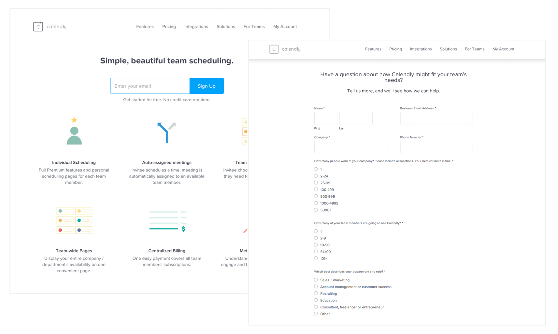
Original Landing Page
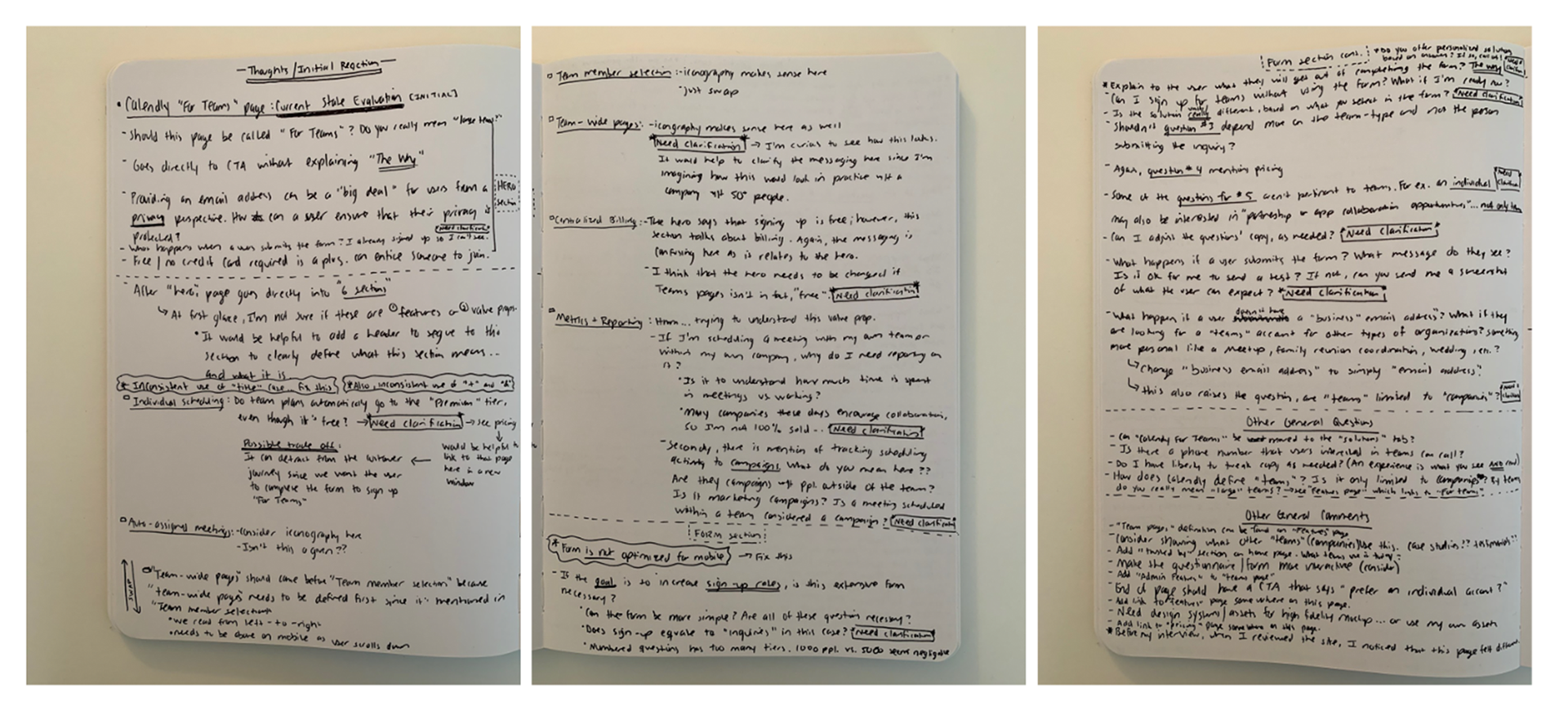
Notes - The Evaluation
GET TO KNOW THE USER
In order to get to know the user, I created a persona to facilitate this process. This persona helped me to understand the user’s needs, frustrations, goals, and assumptions. I also created clear user stories, drawn from the Jobs to be Done methodology to clearly articulate the user’s need and goal. Lastly, I mapped out a multi-pronged user journey to understand the user experience before, during, and after the user’s interaction with the web page.
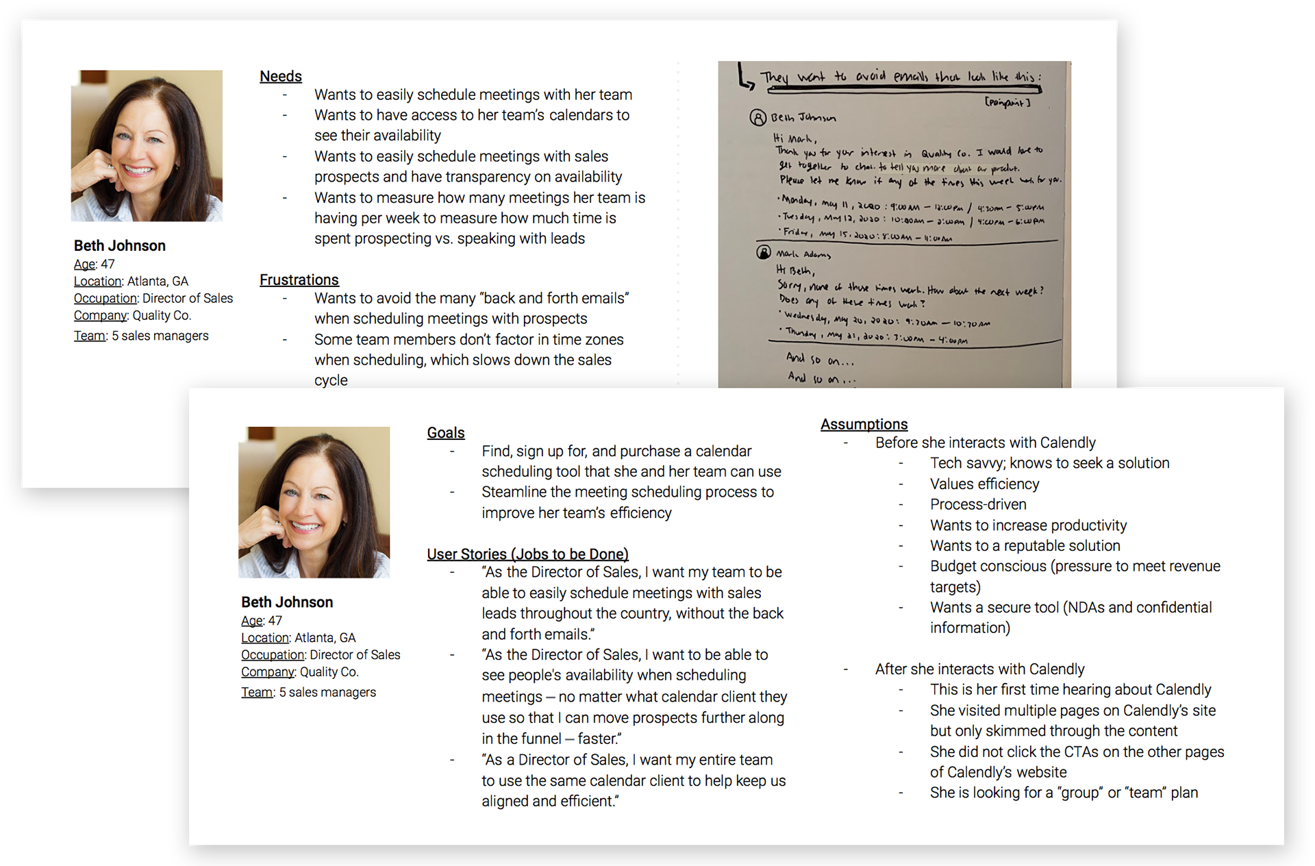
User Persona
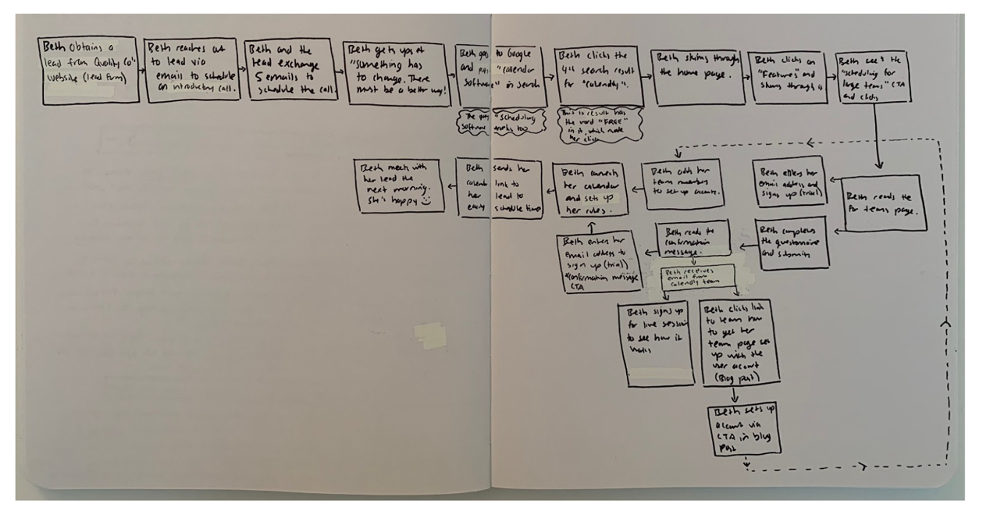
User Journey
EXPLORE THE APPROACH
I created mobile-first wireframes to quickly illustrate the flow, functionality, and features of the page. I also explored the form's usability and considered the use of radio buttons vs. drop downs, multi-column entry-forms vs. single column, and content organization. Since I was proposing the addition of multiple content blocks to clarify the solution's value proposition, how it works, and features, I wrote the copy to accompany these sections. Lastly, I created low fidelity mockups for both mobile and desktop to craft the visual approach.

Wireframes - Mobile
Low Fidelity Mockups - Desktop
CREATE THE SOLUTION
I proceeded to create high-fidelity mockups of my solution for this design challenge. I designed the page, created the illustration and iconography style, and wrote the content for four new sections. I also designed screens to showcase what would happen once 1) a user clicked one of the call to actions and 2) submitted the contact form. Click here to view the prototype.
IDENTIFY NEXT STEPS
Any design challenge should be met with the mindset of constant iteration to improve the user experience. This includes reviewing the page’s performance, identifying optimization opportunities, conducting A/B and user tests, iterating, and testing again.